

 next
next latest
 Side-by-side comparisons
December 7, 2012
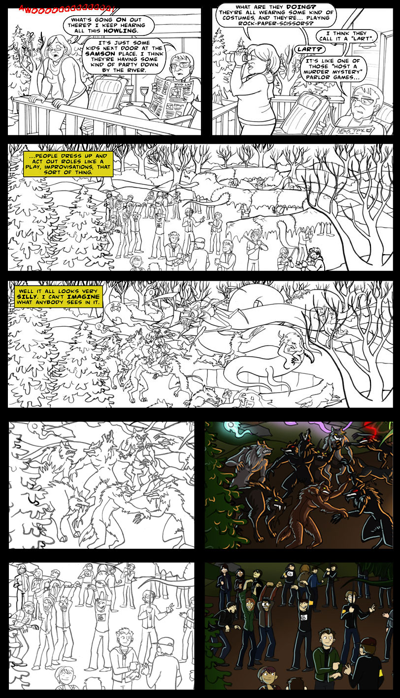
Hey everyone! I had some very nice emails asking me to leave the black and white version of yesterday’s strip up. So, rather than post the color version today (Friday), I put the color version up where it’s supposed to go in the archives and made this side-by-side comparison for today.
Usually, I’d worry a little more about line weights in a big crowd scene like this, since they’re one of the few ways you can tell depth in a black and white scene. But, since I knew I was going to be coloring it anyway, and because the details (like the two zoomed-in fight scenes at the bottom) were so small anyway, I left the line weights fairly consistent out of necessity – they’re about the smallest my brush pen will go, and at one point I gave up and just used a fine-tipped Sharpie to get some of the tiny details in!!
Anyway, you can really see what a big difference the colors make, as well as how the lighting from the different sources (the moonlight, the firey pit) can make the characters stand out from a dark background.


Comments